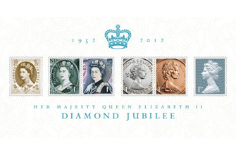
 The Royal Mail’s commemorative Queen’s stamps were recently launched with a compelling new design treatment from long time collaborators Sedley Place.
The prestigious assignment continues the tradition of issuing new stamp designs to mark significant historic occasions. With hand-drawn lettering and pattern work by founding partner Gerry Barney, the intricate design features scroll work and patterns that are based on those first appearing in the official programme commemorating the 1952 coronation of Her Majesty the Queen.
“At Sedley Place we have a rich history of working with some of the world’s most iconic brands. We are thrilled to have completed this rare assignment to commemorate the Queen’s Jubilee,”comments Mick Nash, Sedley Place Managing Director. “Whether a consumer product, destination resort or commemorative stamp,our process is always to identify and maintain a brand’s intrinsic value, moving it forward in an authentic manner that keeps current audiences engaged and attracting new ones.We are strong believers in a craft-based approach that integrates new technologies with traditional design functions like draftsmanship and lettering art. This is at the core of the unique value proposition that Sedley Place delivers,” adds Nash.
The Dorothy Wilding stamps are an important, definitive series, featuring the photographic portrait of Queen Elizabeth II taken by society photographer Wilding in February 1952. The Queen is featured wearing a diamond diadem made for George IV in the 1820s. The same diadem was worn by Queen Victoria on stamps such as the Penny Black. The Wilding series also marked a number of technological advances, including the first ever use of phosphor bands to aid the mechanical sorting of mail.“With a heritage brand of this stature, the design evolves, but it’s not about trying to reinvent the wheel. The stamps are new, yet always in keeping with what’s gone before,” says Barney. The stamps, which are currently available at post offices across the UK and feature hand-drawn lettering and pattern work, represent one of several heritage brands that the firm has developed and managed using its unique craft approach.
Long-standing relationships with iconic brands such as The Gleneagles Hotel, Johnnie Walker and the Royal Mail are built on a total understanding of the brands’ histories. Sedley Place’s Gerry Barney developed an international reputation as a designer creating logos such as the iconic British Rail identity as well as the VAG rounded typeface created for VW and now widely used, including by Apple on their keyboards. Originally a lettering artist, Gerry designs fonts by hand and then works with SedleyPlace’s design technicians to create digital masters of them.
For the Diamond Jubilee stamps, the background pattern work on the miniature sheet is hand-drawn and based on a pattern that appeared in the official program of the Queen’s Coronation. Scroll work on the Dorothy Wilding stamp and all the values and lettering are also free hand, all designed with the reference point of the Coronation programme in mind.“Being able to send a digital version of an original pencil sketch to a client for review is a unique practice in the design community, one that is emotional and immediate and allows for more of a dialogue with the client,” says Gerry.
In addition to its long-standing assignment with the Royal Mail, Sedley Place has a multi-decade history in developing design solutions for some of the world’s most established brands. A milestone for Sedley Place was designing the original packaging and graphics for the Johnnie Walker Blue Label in 1988. Originally called Johnnie Walker’s Oldest, as the product was a blend of 60-year-old whiskies, the Blue Label was created to help establish the brand as a premium product, not just a commodity. The design of the bottle, based on original Victorian blue glass bottles was an attempt to recreate history and allow the consumer to be transported back in time. The Blue Label bottle was redesigned by Sedley Place 20 years later with a more prominent Johnnie Walker monogram and a thicker and deeper cobalt glass to give the brand even more presence and authority in the hand. The agency’s redesign has recently won a Bronze Award at the2012 Cannes Lions Design Awards. Another long-standing and Scottish client is the almost century-old Gleneagles Hotel, most famous for its world-class golf courses andPGA Championships.
Sedley Place has been involved in multiple branding and redesign projects for Gleneagles over the last fifteen years but was initially hired to define the resort’s brand and establish a new,original identity for the brand after Diageo acquired it. The logo,featuring the image of an eagle with the illustrious hotel name underneath in an original, hand-drawn font, was inspired by Scotland’s iconic clan badges – a way of implying the rich heritage of Scotland without being overtly Scottish. Fonts for all marketing materials and anew website design were born out of the brand identity expression.

