 Package design, one of the least heralded aspects of marketing, is a major factor behind the most successful product launches over the last two years.
The latest annual “Breakthrough Innovation Report” from research firm Nielsen analysed 9,900 product launches across Europe. From among many successful initiatives, Nielsen selected 11 that truly broke through. All 11 – which include Colgate®, Air Wick® and Whiskas® – generated at least £7.5/€7.5 million sales in the first year of launch (€5 million for launches in Eastern Europe) and maintained at least 90% of that figure in the second year.

Package design emerged as the key theme due to the amount of consumer decision-making that happens as they stand in front of the shelves.
“Package design is the dark horse of the marketing world. It receives little attention compared to other marketing disciplines, and its impact tends to be vastly underestimated,” says Ben Schubert from Nielsen’s Innovation Practice in Europe and co-author of the report. “Back-to-basics marketing such as how essential it is to stand out at the shelf has become slightly lost due to marketers’ increasing focus on where to advertise in a media-saturated world. Nearly 60% of product decisions are made at the shelf, and 56% of European consumers say in-store discovery is one of their top information sources for new products, compared to 45% for TV ads.”
Schubert points to winning examples by Whiskas in the UK and Air Wick but starts with the most striking example of package design’s role in a successful product launch – Gold Mine Beer’s Zhivoe, Russia’s first premium unpasteurized beer.

Since unpasteurized beer has a limited shelf life but a fresher taste, the brand’s agency created a bottle that resembles a freshly poured glass of beer. This “forged a more visceral connection in consumers’ minds with the refreshing taste of draft beer and a bar-like situation,” says Schubert. “It was so unlike traditional beer packaging that the bottle practically leapt off shelves and retailers actively began requesting to stock the product.”
Whiskas went for a new direction in their cat food package design. “Our new packaging is designed to help cat owners buy the right food for their cat’s age,” says Gina Head, senior brand manager at Mars Petcare. The design features clearer labelling of the target age ranges, more vibrant colours, larger fonts, a brighter food shot, and a larger cat image. “It may sound simple, but in the split-second when consumers make that decision about which cat food to buy, these things really make a difference and give consumers confidence that their cat is getting the right nutrition.”
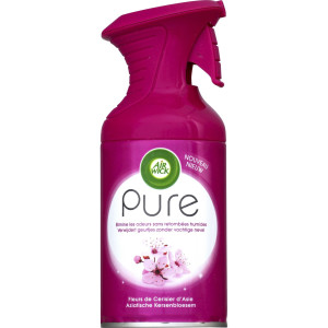
 For Air Wick’s Pure air freshener spray, testing revealed consumers loved a benefit the team had completely overlooked because it was a by-product of how the formula was developed – unlike traditional aerosol air fresheners, it didn’t wet surfaces such as furniture, clothing or skin. Thus, Airwick went for a cleanly designed bottle to support this key attribute, an aerosol that dispersed immediately in the air without spray settling. Retailers immediately saw the value of the concept’s elegant simplicity which enabled Pure to command a price point 20% above competitive offerings.
Schubert also cites a 2015 soft drink Breakthrough Innovation winner as an example of how much attention marketers should pay to package design. “They vetted over 30 different bottle designs whereas the typical design agency presents just three or four to the brand, who only select only one for further development.
Based on an analysis of more than 90 package redesign initiatives, brands who test at least five designs with consumers are able to identify an option that performs significantly better on consumer preference and shelf standout than brands who explore fewer design directions.”
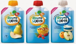
 • Russian fruit puree drink FrutoNyanya Na Progulku used a Gualapack – a spouted pouch – designed so small children could feed themselves. This became an integral part of the product’s value proposition. Later the brand began to include lids that can be stacked like toy blocks to help children develop motor skills. “We successfully launched the fruit and vegetable puree in the new Gualapak ‘on-the-go’ format. The pack is bright, comfortable and safe but also has additional advantages. Because children can eat from it on their own, it enables them to form and develop basic cognitive functions: attention, memory, learning abilities, the ability to perceive information – but also to execute the acquired knowledge and develop motor skills. The multi-coloured caps help a child to learn about colours and can be used as building blocks,” says Eleonora Chernetskaya, director of public relations at Progress.
• pladis’ O’lala Sufle was the first portion-sized cake consumed with a spoon. It drove home a core differentiator as without the spoon “it would be perceived as just another cake,” says Nihal Gül, marketing director of biscuits and cakes at pladis Turkey. Including it also provided unexpected benefits, “After launch, we realised the product made a great addition to packed school lunches. We hadn’t thought of this initially, but the spoon adds a lot to the convenience of the product.” They settled on a distinctive purple colour scheme and a mouth-watering image of a soufflé overflowing with liquid chocolate because “we learned that packaging can make or break perceptions and it was instrumental for the success of the launch,” added Gül.
• Package design was a crucial vehicle for Procter & Gamble Italy’s AZ Complete – a two-in-one product combining mouthwash and toothpaste. AZ explored multiple design directions and relied on objective consumer feedback for the final decision which ensured that consumers immediately understood the product and the premium benefits it delivered. The winning design displayed a very clear graphic of white, sparkling toothpaste and mouthwash swirling together into an AZ Complete tube.
• France provided 3 of the winners; Germany, Russia and Turkey 2 each; and 1 each from the U.K. and Italy.
• 4 of the winners were food, 3 were beverages, 2 from personal care, 1 each from home care and pet care.

