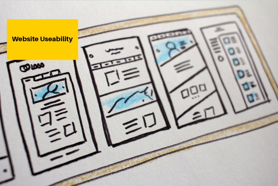
Having a nice-looking site is important, but what really matters is how easy it is for your users to navigate and connect with your content. Creating a complicated site with bad usability can lead to frustrated visitors and high bounce rate, which is not what you want for your business or nonprofit.
A website’s usability is the key to whether visitors will stick around and connect. They are unlikely to do so if it takes them forever to find information or complete an action, like a contact form or phone call. You need all significant parts of your site to be highlighted and easy to use and find, or else it will confuse your users, making them abandon it even faster. To avoid any problems caused by your site’s poor usability, this article will share some main points that can help you improve your user experience.
Optimize its design
User experience is a big thing nowadays, and you should make sure that your website visitors have a good, seamless, comfortable overall site-using experience. Whether they are looking for information about your services or want to take a specific action (filling out a form, making a call, getting a personal etc.), they should be able to easily spot those next steps in your site’s design and navigation.
Websites that are easy to scan have better chances of retaining users and making them hang around for longer. Use headings, small paragraphs, and lists to help users scan a page. You can also try using white space to make the page easier on the eyes and allow for a better reading experience.
Another important aspect of a user-friendly website design is quick load time. The human attention span is short, and people quickly leave a page that takes too long to load. To keep your website up to speed, avoid putting too many images and videos on your pages. You should also make sure that it supports multiple platforms and is loaded quickly on both PC and mobile devices.
Many of today’s Internet users have mobile devices, meaning that load times can make or break a site’s success. A website that loads slowly may not rank well in search engines, so it’s critical to test the site for issues with its coding and try to speed things up as much as possible.
To optimize your pages, you need to minimize load times, using JS and CSS aggregation to minimize requests, image optimization, web font optimization, implementing the AMP standard, and other techniques. These measures will improve your site’s speed and make it more attractive to users.
Consider its layout
By altering and simplifying your site’s layout you can easily make it more user-friendly. For example, you should use white space to keep the page clean and organized. White space helps the eye focus on text and titles. It also creates a sense of openness. It is also important to include social media icons on the site so that users can easily share content from it.
When designing your layout, think about your ideal buyer personas and then design your content layout to meet their needs. For example, if your buyers prefer large-scale images, then this should be reflected in your web design. You should also place contact, about, and FAQ links where they are usually found on websites.
In addition, you should make sure that your menus are easy to navigate. This will help users find what they are looking for and contribute to SEO friendliness. Many convenient menu types include drop-down, flyout, accordion, push, and circular menus. Choose the one that best reflects your category structure and matches the look of your site.
Pay attention to content
The way in which information is presented on a website is incredibly important to its user-friendliness. A cluttered site with overlapping information and confusing links can be hard to read, let alone navigate through. A website that uses a clear and recognizable format for its pages is more user-friendly, as are those that use headings, small paragraphs, and lists to break up large amounts of text. This formatting also applies to navigation links, which should look clickable and be clearly labeled as such.
A user-friendly site should have social media icons to allow visitors to easily share content. This is a great way to get more people to visit the website and interact with its content. Additionally, it’s important to have a visible contact page with a phone number or email address to contact the company. This way, visitors can easily reach out to the company and have their questions answered promptly if they have any questions.
The last piece of the puzzle is ensuring that your calls-to-action are actionable, meaning that they help people accomplish what brought them to your site in the first place. For example, if your site asks for donations, you want to clarify that they will save lives by donating, not just that you are asking for money. It’s also important that your forms follow best practices such as readable text size and contrasting colors and don’t require more fields than you need.
Final words
A user-friendly site is easy to read, with a clear layout and navigation system. It has a fast load time and is responsive on both tabletop and mobile devices. It has social icons that make it simple for visitors to share your content or contact you via phone or email. It also has a clearly visible call-to-action, which can be as simple as an obvious “buy now” button or as complex as a form requiring detailed information to receive an estimate or other service.
Lastly, your site should include social media icons to encourage people to share content and engage with you on other platforms. Also, make sure that any important notifications such as instant validation, red and green color indicators, progress bars, floating hints, address-finding tools, and the like are easily spotted.
